00Context
I have been running the Nothing OS 5.0 beta on my Phone (3) for about a week now. Short version: this is probably the biggest update since Nothing OS 2. Not because of one headline feature, but because almost every control you touch every day has been reworked.
01Design
The first thing you notice is consistency. Everything follows the same language now, and if you compare it to the new Gallery, which arguably set the tone, you can see that the same care was applied everywhere else. The new Geist typeface is my favourite part. It has character without getting in the way, and the smaller dot-matrix accents are much easier to live with than before.
Settings in particular feels clean and readable now. The status bar icons are where I noticed the least change, but they looked good before, so no complaints there.
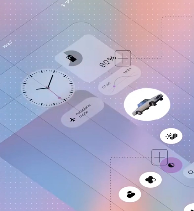
The soft blur that showed up in Gallery is now on the homescreen too, where it is called translucent. Worth knowing: the new Lucent look is genuinely translucent rather than frosted. The Gallery navigation bar is frosted, so you barely see through it, while Lucent lets a lot of the wallpaper come through. That applies to widgets, folders and a few other elements, not to app icons.

02Homescreen
You now pick between three styles: Lucent, Classic and Dynamic. Classic is the Nothing OS look you already know. Lucent is the new translucent one. Dynamic takes its colours from your wallpaper, Material You style, and you can combine that with the Nothing icons or the new material ones.


This is the part I want to flag. With Nothing OS 3 and 4 you could do whatever you wanted and the homescreen still looked like Nothing. With Lucent and Dynamic you can build some genuinely ugly homescreens. Much more customisation is possible, and that cuts both ways.
My one real wish: let people control how frosted or how transparent the widgets are. Depending on your wallpaper and whether you are in light or dark mode, text on widgets can get noticeably harder to read. A single slider would fix it, and it feels like a missed opportunity.


Batch editing on the homescreen is a nice quality of life addition. Selecting and moving several apps and widgets at once is practical, although honestly not something I reach for often.
03Lock screen
The new lock screen customisation flow fits the rest of the design well. I could only try Gooey, which is exactly as fluid and squishy as the name suggests. It looks good, but I still prefer the older clockfaces. Micrographics, the terminal inspired one, was not in my beta build yet.

04New widgets
Away Time counts how long you have left the phone alone and shows your longest break and how your screen free time develops over the week. It looks good and it fits the direction Nothing has been pushing since the Glyph Interface: use the phone less.
Collector is the one I actually enjoy. You capture something from the Gallery or with the camera, it gets cut out like a WhatsApp sticker, and it lands on your homescreen as part of a rotating collection. Simple idea, very well executed.
There is also a Glyph Timer widget that starts a countdown from the homescreen and mirrors it on the Glyph on the back.
05Glyph
Previously you had to dig through Settings for a while before you found the Glyph settings. Now everything lives in one dedicated app that you can put on your homescreen. Much easier access, and a small change with a big everyday effect.
While we are on the topic, a bit of self promotion: my app Dot Hub for Glyph Matrix now supports widgets too, so you can look at a Glyph Matrix on any Android phone, no Phone (3) required.
06Performance
Nothing OS 5.0 is faster, and more importantly it feels snappier. Many animations have been reworked and everything runs quicker. I used to keep animation scale at 0.5x in the developer options. I have switched that off, because the stock speed is genuinely pleasant now. Opening and closing apps feels more natural than before.
The redesigned Bluetooth controls in Quick Settings are a solid improvement as well. Faster access to your devices, and it pays off especially with Nothing and CMF audio gear.
07Essential AI
Essential Space is a great idea that I still only use sporadically. The model was not that good in the past and I had language issues, since my phone is set to English while I write and speak a lot of German. That caused problems. The new model clearly understands me better.
MCP support, which lets an AI agent like Claude access selected information from Essential Space, was not in my beta yet, so I could not test it. Same for the updated Essential AI tools, which will most likely arrive as a separate app update.
Essential Apps I had already tested before through its own beta, and it works well on the phone, just like on the web. I built a few nice widgets with it, and those will go up on Playground once Playground is back.
08Android 17


The biggest change here is separate Notifications and Quick Settings. Swipe down on the left for notifications, on the right for Quick Settings. It works well, but I have always used Android the other way, so I had to adjust, especially in landscape, where I kept hunting for things. It is a matter of habit and I suspect it is faster once you are used to it. It is also optional, and I will probably stay on the combined version for now, partly because scrolling through Quick Settings was broken on my build. I reported it and was told it will be fixed, so treat that as a beta quirk rather than a verdict.
The new privacy indicators are a good addition. Knowing which app uses what and when is simply useful.
Enhanced Quick Share and the improved screen recording I have not tested. Live updates already worked well for me before and are supposed to get better, but I have not had a real use case yet. The 3D emoji were fine before and are fine now, so no reason to complain.
09Verdict
Nothing OS 5.0 is a big, confident update. The design pass is thorough, performance is noticeably better, and the Glyph app plus the new widgets are the kind of small changes you feel every day. My only genuine criticism is that the new transparency needs a readability control, and that the extra freedom on the homescreen makes it easier to end up with something that no longer looks like Nothing.
10Availability
Phone (3) users can sign up for the Open Beta from today through the Nothing Beta Hub. Everyone else waits for the stable build, which starts in mid October and reaches the rest of the lineup into January:
| Model | Open Beta | General release |
|---|---|---|
| Phone (3) | 26 August | mid October |
| Phone (4a) Pro | early September | early November |
| Phone (4a) | late September | early November |
| Phone (3a) Pro | late September | early November |
| Phone (3a) | late September | early November |
| Phone (2a) | mid October | mid November |
| Phone (2a) Plus | mid October | mid November |
| Phone (3a) Lite | no beta | late December |
| Phone (4b) | mid December | mid January |
| CMF Phone 2 Pro | no beta | mid January |
All dates are estimates and the rollout happens gradually by region and carrier. Phone (1), Phone (2) and CMF Phone 1 have reached the end of their major software support and will not get Nothing OS 5.0.
— nostream